
In fashion, color plays a pivotal role in evoking emotions, conveying messages, and creating impactful visual experiences. From the vibrant reds that signify passion and power to the cool blues that inspire tranquility, color has the ability to communicate on a deep and subconscious level. Color psychology in fashion delves into the profound impact that different hues have on our thoughts, moods, and even our perceptions of clothing. It goes beyond mere aesthetics and encompasses a nuanced understanding of how colors can shape our personal style and influence our interactions with the world.
Every shade possesses its own unique essence, capable of evoking a spectrum of emotions and associations. Whether it’s the boldness of a fiery orange or the calmness of a serene green, colors can ignite desires, spark memories, and create a language that transcends words.
Fashion designers and stylists have long been aware of this phenomenon, carefully selecting and combining colors to enhance the inherent qualities of their designs. The strategic use of color allows them to heighten drama, lend sophistication, or provoke playfulness in their creations.
Moreover, color psychology in fashion doesn’t limit itself to the aesthetics of individual garments but extends its influence to the overall styling of an ensemble. The way colors harmonize, contrast, or clash can shape the overall impact of an outfit, sending powerful signals about the wearer’s personality, mood, or intentions.
The Impact of Color in Fashion
Color is a powerful tool in the world of fashion, capable of influencing our emotions, perceptions, and even our behavior. From the runway to the streets, the impact of color in fashion is undeniable. In this section, we will explore how different colors affect our wardrobe choices, our confidence, and our overall aesthetics.
The Emotional Significance of Color
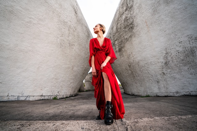
Red – Passion and Power: The color red ignites passion and conjures images of strength and confidence. In fashion, a little red dress or a bold red power suit can command attention and exude a sense of authority. Adding red accents to an outfit instantly boosts its allure and draws the eye.
Blue – Calmness and Serenity: Blue is a color that exudes tranquility and calmness. From soft baby blues to deep navy hues, this color is often associated with trust, stability, and reliability. Wearing blue can create a sense of peace and openness, making it a popular choice for professional settings.
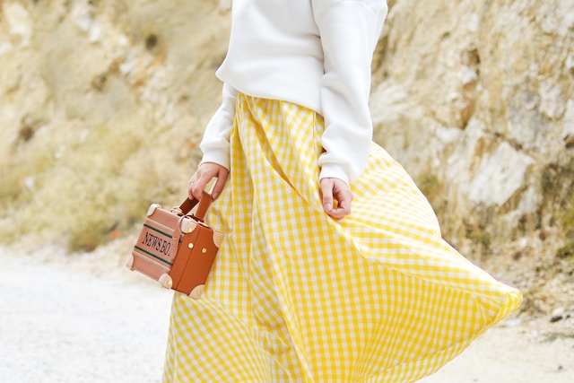
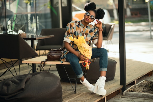
Yellow – Joy and Positivity: Yellow is the color of sunshine and happiness. It radiates positive energy, optimism, and warmth. Incorporating yellow into your wardrobe can instantly brighten your mood and uplift those around you.
A splash of yellow in an outfit can add an element of playfulness and cheerfulness.
Color Combinations and Styling
- Harmonizing Colors
When it comes to creating a visually appealing outfit, color harmony is crucial. Harmonizing colors create a sense of balance and cohesion. A monochromatic ensemble, where different shades of a single color are combined, can create a sophisticated and elegant look. Similarly, analogous color schemes, which involve using colors that are adjacent on the color wheel, offer a harmonious and pleasing aesthetic.
- Contrasting Colors
Contrasting colors create visual impact and can add a dynamic element to your outfits. Pairing complementary colors, those directly opposite on the color wheel, creates a striking contrast.
This can make both colors appear more vibrant. For example, wearing a green dress with a contrasting, bright red belt can create a bold and eye-catching look.
- Color Clashing
Color clashing, or deliberately combining colors that do not traditionally “go together,” can create a fashion-forward and creative look. This trend challenges conventional color rules and encourages experimentation. However, mastering the art of color clashing requires careful consideration and an understanding of how certain colors interact with each other.
Cultural Symbolism
Colors hold different cultural significances around the world. For example, in many Asian cultures, red is a symbol of luck and good fortune, while in Western cultures, it is often associated with passion and love. Understanding the cultural implications of color can help fashion enthusiasts incorporate these meanings into their outfits and show respect for various traditions.
Neutral Colors and Their Significance:
Black – Elegance and Mystery: In color psychology, black is a color often associated with sophistication and elegance. It possesses a timeless quality that lends an air of mystery to any outfit. Black is also known for its slimming effect, making it a go-to choice for many individuals wanting to create a flattering silhouette. From little black dresses to tailored black suits, this versatile color adds a touch of class and allure to any ensemble.
White – Purity and Simplicity: White represents purity, simplicity, and innocence. It has a fresh and clean quality that can create a sense of calmness and serenity in an outfit. From crisp white shirts to flowing white dresses, wearing white allows for endless possibilities for accessorizing and highlighting other colors. Additionally, white is often associated with new beginnings, making it a popular choice for weddings and formal events.
Gray – Neutrality and Versatility: Gray is a neutral color that bridges the gap between black and white. It symbolizes practicality, neutrality, and versatility. Gray can be a sophisticated and understated choice, providing a subtle backdrop for bolder colors or patterns. From charcoal gray suits to soft gray sweaters, this color effortlessly blends with other shades, creating a balanced and timeless look.
Beige – Subtlety and Serenity: Beige, often referred to as a creamy or nude color, conveys subtlety and serenity. It is a soothing and calming color that can evoke feelings of relaxation and comfort. Beige is often associated with natural elements, making it a popular choice for casual and bohemian-inspired fashion. From flowy beige skirts to cozy beige sweaters, this color brings a sense of tranquility and earthiness to an outfit.
Brown – Warmth and Nature: Brown in color psychology is a color that brings to mind warmth, stability, and the earth. It is often associated with feelings of reliability and dependability. From rich chocolate browns to warm caramel tones, this color can add depth and richness to an ensemble. Brown is also commonly used in fall and winter fashion, reflecting the changing colors of nature during these seasons.
Vibrant Colors and Their Effect:
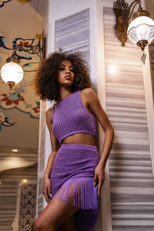
- The Enigmatic Allure of Purple
Purple is a color that exudes mystical charm and encourages individuality. Its rich and regal hue is associated with luxury and creativity. Wearing purple can make a bold statement, symbolizing a willingness to embrace uniqueness and stand out from the crowd. From deep amethysts to vibrant violets, in color psychology, purple can evoke a sense of intrigue and sophistication, making it a favorite among fashion enthusiasts looking to make a memorable impression.
- The Lively Energy of Orange
Orange in color psychology is a color that radiates enthusiasm and vibrancy. It’s often associated with feelings of excitement and adventure. Wearing orange can inject a burst of energy into an outfit, instantly drawing attention and creating a positive impact. From tangerine tops to burnt orange accessories, this color sparks joy and exudes a sense of playfulness. Donning orange can be a powerful way to embrace a bold and extroverted fashion persona.
- The Exuberance of Pink
Pink is a color that conveys femininity, tenderness, and youthful charm. Its range of shades, from soft pastels to vibrant magentas, allows for diverse styling options. Wearing pink can evoke feelings of sweetness and innocence, making it perfect for romantic and whimsical looks. From blush pink dresses to hot pink accessories, this color can create a touch of ethereal beauty and bring out the inner romantic in anyone.
Combining Colors Strategically
Color combinations in fashion can have a profound impact on the overall aesthetic and message of an outfit. By strategically combining colors, fashion enthusiasts can create visually appealing and harmonious ensembles that showcase their personal style and individuality. Here are some tips and tricks for combining colors in fashion:
Complementary Colors: Combining colors that are directly opposite each other on the color wheel creates a striking contrast and can make both colors appear more vibrant. For example, pairing a deep blue top with a vibrant orange skirt can create an eye-catching and bold look. When using complementary colors, it’s important to consider the intensity and saturation of the hues to ensure they harmonize well.
Analogous Colors: Analogous color schemes involve using colors that are adjacent to each other on the color wheel. This creates a harmonious and pleasing aesthetic. For example, combining shades of yellow, orange, and red can create a warm and energetic look. Analogous color schemes work particularly well for creating a cohesive and balanced outfit.
Monochromatic Looks: A monochromatic ensemble involves using different shades and tones of a single color. This approach creates a sophisticated and elegant look. For example, pairing a light pink blouse with a darker pink skirt and accessorizing with rose gold jewelry can create a feminine and cohesive outfit. Monochromatic looks are versatile and can be easily dressed up or down.
Color Blocking: Color blocking involves using large blocks of solid color to create a bold and graphic look. This technique allows you to experiment with contrasting and complementary colors in a way that emphasizes each hue’s vibrancy. For example, pairing a cobalt blue blouse with a sunshine yellow skirt creates a visually striking outfit. Color blocking can add a sense of playfulness and vibrancy to your wardrobe.
Print Mixing: Mixing different prints and patterns is another way to combine colors strategically. When print mixing, it’s important to pay attention to the color palette of the prints to ensure they cohesively blend together. For example, pairing a floral top with a striped skirt can create a visually dynamic and playful outfit. When print mixing, consider choosing prints that share a common color or theme to maintain a cohesive look.
Color psychology in fashion is an art form that goes beyond mere aesthetics. It allows designers and fashion enthusiasts to tap into the power of color to evoke emotions, convey messages, and create impactful visual experiences. It is a powerful tool that has the ability to influence emotions, perceptions, and behavior. It can uplift moods, ignite confidence, and make a lasting impression. So go ahead, embrace the power of color and let your personal style shine through the vibrant palette of possibilities.